Samantha Chow


Streaming for Members

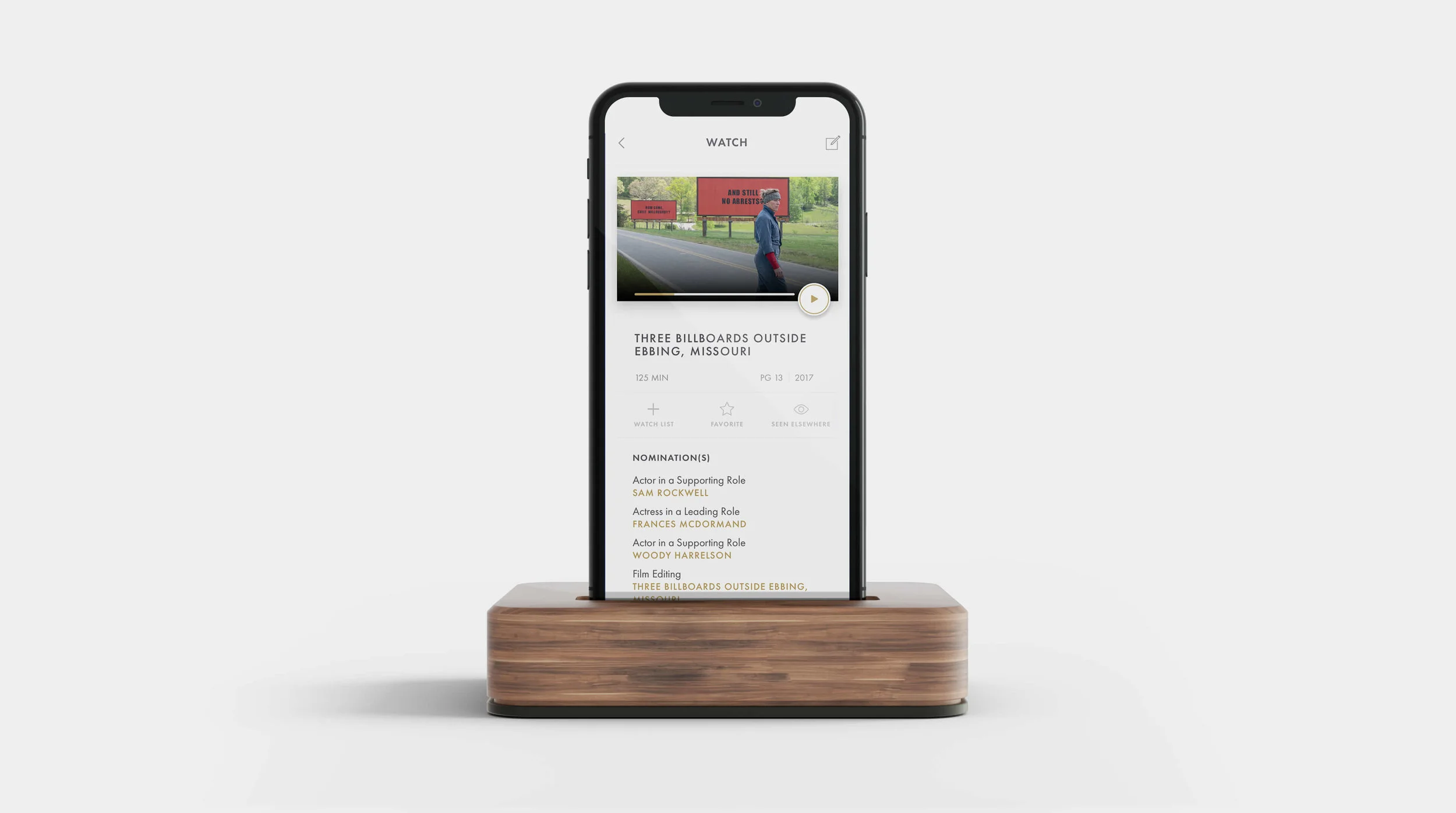
Every year, Academy members watch hundreds of movies before finally casting their ballots to choose the ultimate list of Oscar winners. Since 2018, I’ve worked to make watching movies more accessible as part of a members-only iOS app.

(All opinions in this case study are my own and do not necessarily reflect the views of the Academy of Motion Picture Arts and Sciences.)


iPhoneX-dock.jpg


The Challenge

The Challenge: Preserve the Past, Honor the Present, and Shape the Future

Since Netflix introduced streaming to the world in 2007, the film industry has braced itself for the transition from screening to streaming. The Academy has been mailing out physical DVD screeners to members for decades, but it has felt an increasing demand from members to go digital.

Our challenge was to create a streaming experience for members that accounted for the nuances of watching movies for voting purposes.

The Academy App would be a members-only app that lets members stream Oscars-contending movies for free. We hoped to make watching contenders more convenient and accessible to members living both in and outside of major cities.

My Role

While this case study focuses on the streaming aspect of the app, I have been responsible for the app’s overall user research, UX design and design execution since September 2018. I collaborate with a visual designer on the UI, and work alongside a product manager, a business analyst, two developers and our CIO to communicate the experience strategy and clarify interactions and design specs.

The app is currently in development and slated to launch in early 2020.


the product

Watch More Movies.

It’s about time that movie screeners enter the 21st century.
With the Academy Member App, members can browse and stream Oscar-nominated movies, and meet their eligibility requirements, before casting their ballots.


Stream Anywhere


Whether you’re on location a thousand miles from home or on your living room couch, you can watch this year’s Oscar contenders. Stream on your phone, to Google Chromecast or Airplay.


Watch Landing Copy 2.png


Everything You Need to Know

Check nominations details, film credits and eligibility requirements right here in the app before submitting your Oscars vote.


Watch Landing Copy.png


Track Voting Eligibility

Goodbye, paper forms. If you saw a nominated film at a regular cinema, just log your showtime information in the app to fulfill eligibility requirements.


Watch Landing Copy 3.png


Discovery

User Insights

By taking advantage of user proxies and scraping the web for news articles, blogs and social media posts, I uncovered these key insights that drove the design process.

film reel.png
 

Members don’t just like screeners — they love them. Some say it’s the biggest perk of being a member.

As movie lovers, members get excited to watch movies for free and in the comfort of their own homes. Even members like Tiffany Haddish and Lee Daniels love screeners.


vote.png
 

Members watch a lot of movies before voting.

Members see voting for the Oscars as their most important Academy duty. Out of the 9,000 members who are eligible to vote, most members actively vote every year. As a result, they watch a lot of movies throughout the year to form opinions on what they will vote for.

popcorn.png
 

Opinions are split on whether movies should be watched in theaters or at home.

Some members believe movies were intended to be watched in theaters for the full experience, while others place more value on the convenience of watching movies at home. This is a hotly debated topic in the film community that members have not reached a general consensus about.

 
Grey BG.jpg


THE FRAMEWORK

How Might We…

The biggest challenge that I faced throughout this project was balancing inflexible business rules with creating a fun and enjoyable user experience.

One method I used to keep our creativity flowing and not get bogged down by constraints was to create the following “how might we” statements:

  1. How might we display the movies in a way that is personalized to the user yet not biased?

  2. How might we create a streaming experience that works for both voting and non-voting members?

  3. How might we account for the seasonal nature of streaming on the app?


glenn-carstens-peters-EOQhsfFBhRk-unsplash.jpg


Competitive Analysis

While they’re not direct competitors, apps like Netflix, Hulu and YouTube helped me identify the core elements of apps for video content consumption. I took note of what worked, what didn’t, and how they differed to familiarize myself with streaming user flows and design patterns.


Competitive Analysis - Homepage.png


We clearly needed a content home page and video details pages, but once I started to factor in the business rules, it became clear that many traditional design patterns wouldn’t be suitable for this project.


Viewing eligibility

In the early stages of the project, we were asked to explore eligibility tracking in the app. For years, this was a very manual process that was hard to manage for both members and our membership team. We went into this challenge knowing that there might not be a perfect solution.

Members must watch at least the first 1/3 of the film to vote for the film.
— Excerpt from a requirements document

After reading through some those documents, I tried to strip out the jargon and find other ways to communicate the information. The design challenge here was to make these details easy to understand and not let it detract from the viewing experience.

My approach was to humanize our eligibility rules and either rephrase them or represent them visually.


Different approaches to displaying viewing requirements

Visual exploration of progress bars (collaboration with Kaylynn Sheets)


I started by simplifying the verbiage, but struggled to keep it succinct and clear. Usability testing revealed that users didn’t understand what the viewing requirement numbers meant and often interpreted them incorrectly.

After more sketching, I realized that the exact percentage of the viewing requirement wasn’t important to users.

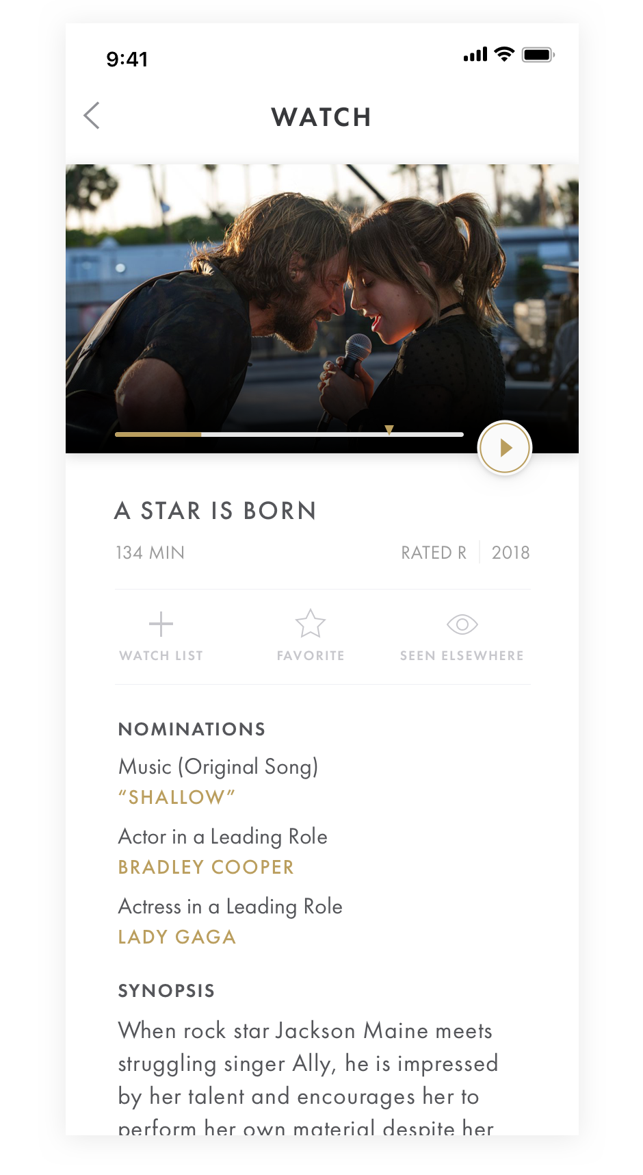
After collaborating with a visual designer, we got the idea to show the viewing requirement as a marker on the progress bar. The progress bar and the marker would only appear after a movie had been started, which would reduce visual clutter and only show the requirement when it was relevant. We were happy to find that this solution performed the best in testing sessions and felt confident to move forward with it.


Being Switzerland

My next design challenge was to display the movies in a meaningful way. The app could stream up to 200 movies, so movie browsing would play a large part of creating a great user experience.

Stakeholders had warned us of creating biases and reiterated the importance of being a neutral party in the voting process. This area is where I had to exercise the most caution as I continued feeling out the possibilities.

Any option that took popularity into account was immediately ruled out. With our options limited, I carefully considered the remaining approaches:

Alphabetical and By Category

Pros:

  • Business often defaults to this way of sorting because it is perceived as the most objective option

  • Good when looking for specific movie if you know its name

Cons:

  • Non-intuitive way to browse movies

  • There is some inherent bias toward movies that start with the letter A compared to the letter Z

By User Preferences

User can choose what categories they’re interested in watching and voting for. This determines how movies are prioritized in their view.

Pros:

  • Gives the user agency and control over their movie watching

  • Not creating bias because since the user is choosing

Cons:

  • Does not encourage users to explore other categories. Users may be more likely to stick to what they know

By Past Voting Behavior

Pros:

  • Good chance of prioritizing what the user wants to see

  • Not creating bias because it is based off of voting history

Cons:

  • User might not understand how movies are being sorted

  • Does not encourage users to explore other categories. Users may be more likely to stick to what they know


While we wanted to personalize movie recommendations, we also wanted to encourage users to broaden their horizons and be open minded about movies outside their comfort zones.

Ultimately, we decided to err on the side of caution and sort movies alphabetically and by category. While this was the least personalized experience for the user, it was perceived as the option with the least risk and biggest chance of being approved, which was a big concern. Hopefully, there will be more wiggle room here once we get user feedback.